
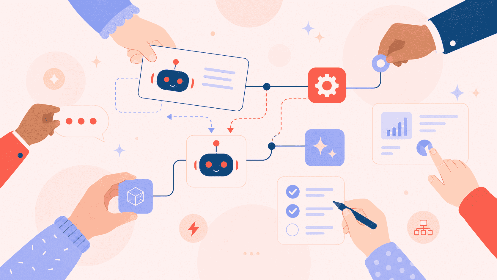
Bold## Introduction
Ever wondered why some apps and websites are a joy to use, while others make you wonder what went wrong? A key reason behind that seamless experience is something called UI design. UI, short for User Interface, is key to creating great digital experiences. It's the art and science of crafting the visual elements you interact with on screens–think buttons, menus, icons, and everything in between.
Think of it this way: if a website or app were a house, UX (User Experience) would be the blueprint, ensuring the house is functional and livable. UI, on the other hand, would be the interior design–the paint colors, furniture, and decorations that make it visually appealing and comfortable.
In this guide, we're going to break down UI design into bite-sized pieces, explore its importance, and even clear up the common confusion between UI and UX. Let's step in and explore this together!
1. Understanding UI Design
What exactly is UI design? At its core, UI design focuses on shaping the visuals that users engage with. It's about designing an interface that looks great while ensuring seamless navigation and clarity.
Imagine you're designing a music streaming app. You'd need to think about:
- Layout: How are the songs, playlists, and controls arranged?
- Typography: What fonts are used for song titles and artist names? Are they readable?
- Color Palette: What colors evoke the right mood? Are they consistent?
- Icons: Are the play, pause, and skip icons clear and intuitive?
- Interactive Elements: How do buttons and sliders respond when clicked or dragged?
It's all about translating functionality into a beautiful and intuitive interface.
2. Difference Between UI and UX
| Feature | UI (User Interface) | UX (User Experience) |
|---|---|---|
| Focus | Visual design and interactive elements | Overall user experience and functionality |
| Primary Goal | Create an aesthetically pleasing and intuitive interface | Ensure the product is practical, easy to use, and delivers a satisfying experience |
| Key Activities | Designing layouts, choosing colors and fonts, creating icons, designing buttons and menus | Understanding user needs, building user profiles, mapping out interactions, and evaluating usability |
| Questions Asked | "Does this look good?" "Is this easy to interact with?" | "Is this easy to use?" "Does this solve the user's problem?" |
| Deliverables | Wireframes (high-fidelity), style guides, mockups, prototypes (visual) | User flows, wireframes (low-fidelity), user personas, usability reports |
| Scope | Specific screens and interactive components | Entire user journey and product interaction |
| Emphasis | How the product looks | How the product works |
| Relationship | Works closely with UX to implement the visual design | Defines the overall structure and functionality that the UI builds upon |
3. Importance of UI in Digital Design
Why does UI design matter so much? Well, in today's digital world, a great first look matters a lot. Users quickly form opinions about a product just by looking at its design. A well-designed UI can:
- Improve User Engagement - A clear and easy-to-use design encourages users to stay and explore.
- Makes Your Brand Trustworthy - Consistent, polished visuals show users you're professional and reliable.
- Gets Things Done Faster - When interfaces are easy to navigate, users achieve their goals without frustration.
- Creates Happy Customers - Smooth experiences turn visitors into fans who keep coming back.
- Boosts Results – Good design helps users take steps like making a purchase or signing up.
In a busy digital landscape, a strong UI can decide if a product succeeds or fails. It's not just about looks; it's about creating a smooth and enjoyable experience that keeps users interested.
Core Principles of UI Design
Let's break down what truly makes a great UI. It's not just about throwing in some colors and buttons—it's about following essential design principles that create a seamless and enjoyable experience for users.

1. Clarity and Simplicity
The best UIs are intuitive, allowing users to navigate effortlessly. Clarity means designing in a way that instantly communicates purpose, while simplicity ensures users aren't overwhelmed by unnecessary elements.
Why it matters:
- Users should instantly grasp the available actions on a screen.
- A crowded layout can confuse users and make them lose interest.
For example, Google's homepage exemplifies this—just a search bar and two buttons.
2. Consistency in Design Elements
Consistency creates familiarity, which makes interfaces easier to use. When design elements behave predictably, users don't have to relearn how things work on every screen.
Why it matters:
- Builds trust and reduces cognitive load.
- Reinforces brand identity through a consistent visual style.
For example, platforms like Facebook ensure uniformity in icons and design across all pages.
3. Accessibility and Inclusivity
A great UI is inclusive, adapting to different users, devices, and situations. Accessibility isn't just a nice-to-have; it's a necessity for ethical and legal reasons.
Why it matters:
- Ensure proper color contrast
- Support keyboard navigation
- Add alt text and scalable fonts
For example, Apple leads here with features like VoiceOver.
4. Visual Hierarchy and Readability
Visual hierarchy directs attention to key elements first. Good readability ensures that content is easy to scan and understand.
Why it matters:
- Use size and spacing strategically
- Highlight key elements with color
- Prioritize clean typography
For example, Medium's blog layout shows this perfectly.
The UI Design Process
Designing a great UI isn't magic—it's a process. From knowing your users to perfecting the final look, every step creates a design that's both attractive and easy to use. Let's explore how it's done!

1. Research & Planning
Before opening design tools, successful UI projects start with homework. This phase focuses on identifying your audience and their requirements.
Start by analyzing your target audience - what devices they use, their tech comfort level, and what problems they're trying to solve. Look at competitors too, but not copy - instead, spot opportunities to do better.
2. Wireframing & Prototyping
Using the gathered research, the next step is to design the interface. Wireframing is like architectural drawings for your UI - simple black-and-white layouts showing where elements will live.
Keep the focus on structure and flow, setting aside colors and fonts for later. Ask: Does this layout make sense? Can users find what they need?
Then create clickable prototypes. These interactive mockups let you test the user journey before writing any code. Tools like Figma or Adobe XD make it easy to turn static wireframes into something you can click through.
3. Visual Design & Branding
Now the UI gets its personality. This is where you bring in colors, typography, icons, and other design elements that reflect your brand's personality.
Create a style guide documenting all design decisions:
- A color scheme featuring primary and secondary colors
- Typography hierarchy (headings, body text, etc.)
- Button styles and interactive states
- Icon sets and imagery guidelines
Remember to design for different screen sizes. A design that looks good on a computer need changes for a phone. Use tools that let you preview designs across devices.
4. UI Testing & Iteration
A pretty interface means nothing if users struggle with it. That's why testing is your secret weapon. Watch real people interact with your design - their confusion points and hesitation spots are goldmines for improvement.
Here's the truth: UI design is a cycle, not a one-way path. You'll often circle back to refine earlier decisions as you learn from testing. The magic happens in these iterations, where good enough transforms into "Wow, this works perfectly!"
This final polish turns your UI from merely nice-looking into something that genuinely helps users and achieves business goals. Because at the end of the day, an interface that works beats one that just looks pretty.
Key Elements of UI Design
Great UI design isn't about making things look elegant—it's about creating interfaces that work. Let's explore the important parts that make digital products simple and enjoyable.
1. Color Theory and Contrast
Colors do more than make your design pop—they communicate meaning and guide users. Pick a main color that suits your brand, then add matching shades.
Remember:
- High contrast between text and background improves readability
- Use color consistently (e.g., blue always means clickable)
- Consider color blindness—tools like Color Oracle help check accessibility
2. Typography and Readability
Your text should be just as clear as your design. Start with a simple font pairing—one for headings, one for body text. Keep these rules in mind:
- Line length should be 50-75 characters for comfortable reading
- Line spacing (leading) of 1.5 times font size improves scanability
- Avoid using more than 3 font styles in one interface
3. Buttons, Icons, and Interactive Elements
These are the touchpoints where users engage with your design. Make them foolproof:
- Buttons should look clickable (shadows, color, ample size)
- Icons need labels until they become universally recognized
- Show visual feedback when users hover or tap elements
4. Layout and Spacing
Good spacing creates breathing room and brings order to your design. Try these techniques:
- Use grids to align elements consistently
- Group related items together (proximity principle)
- White space isn't empty space—it helps focus attention
UI Design Tools & Technologies
Let's explore the key tools that bring UI designs to life. If you're new to design or leveling up your skills, here's a quick look at the tools shaping modern UI.
Popular UI Design Tools
Choosing the right UI design tool shapes your entire creative workflow. Here are the top options designers swear by:
- Figma – The cloud-based favorite for real-time team collaboration
- Adobe XD – Ideal for animation and Adobe ecosystem integration
- Sketch – The original vector-based design tool with robust plugins
- Framer – Combines design with code for advanced interactions
- Penpot – The open-source alternative gaining traction
The best choice depends on your team size, workflow needs, and whether you prioritize collaboration, animation, or developer handoff features. Many designers mix and match tools for different project phases.
Prototyping and Collaboration Tools
Great prototypes need the right tools to bring interactions to life. Here are the top choices for smooth collaboration:
- InVision - Still great for clickable prototypes and collecting feedback
- ProtoPie - Handles complex animations and "what if" scenarios
- Miro/Whimsical - Digital whiteboards for early brainstorming
- Figma - Built-in prototyping that keeps improving
UI Libraries and Design Systems
Want to stop redesigning the same buttons? These tools help create consistent, reusable components:
- Material Design/HIG - Google's and Apple's ready-made systems
- Storybook - Build and document components developers love
- ZeroHeight - Turns guidelines into living documentation
- Supernova - Keeps design systems in sync with code
UI Design for Different Platforms
Not all interfaces are created equal. What works beautifully on a desktop flop on mobile - which is why effective mobile app development is crucial for delivering smooth user experiences across devices. Enterprise apps have completely different needs than consumer products. Let's explore how UI design adapts across platforms.
1. Web UI vs. Mobile UI
| Aspect | Web UI | Mobile UI |
|---|---|---|
| Screen Size | Designed for larger displays (laptops, desktops). | Optimized for smaller screens (smartphones, tablets). |
| Navigation | Uses menus, sidebars, and clickable elements. | Primarily gesture-based (taps, swipes, pinches). |
| User Interaction | Keyboard and mouse-driven | Touchscreen-based with minimal keyboard usage. |
| Layout | Grid-based, allows more complex structures. | Stack-based, simplified for readability. |
| Performance | Can handle heavier graphics and animations. | Needs to be lightweight for fast loading. |
| Responsiveness | Uses responsive design to adapt to screen sizes. | Designed natively for different mobile resolutions. |
| Connectivity | Typically used with stable internet connections. | Must account for offline and low-network scenarios. |
| Call-to-Action | More space for buttons and interactive elements. | Needs to prioritize essential actions due to space limits. |
| Design Approach | Multi-column layouts, hover effects, and high details. | Single-column layouts, larger touch-friendly buttons. |
2. UI for SaaS Applications
SaaS products are the workhorses of the digital world – they need to be powerful yet approachable. Good SaaS UI:
- Prioritizes frequent actions (make common tasks lightning-fast)
- Handles complexity gracefully (progressive disclosure of advanced features)
- Maintains consistency across admin panels, dashboards, and settings
Take Slack's UI – it makes team communication effortless while hiding advanced moderation tools until you need them. The best SaaS interfaces feel intuitive on day one but reveal depth as users grow more proficient.
3. UI in E-commerce and Enterprise Apps
These two worlds demonstrate how UI serves different business goals:
E-commerce UI is all about conversion:
- High-quality product imagery
- Minimal checkout steps
- Strategic use of color and whitespace to guide purchases
Enterprise UI focuses on efficiency:
- Data-dense interfaces (without overwhelming)
- Keyboard shortcuts for power users
- Customizable workspaces
Amazon's product pages and Salesforce's CRM show these principles in action – one designed to sell, the other to streamline complex workflows.
Common UI Mistakes to Avoid
Even experienced designers sometimes stumble into these common traps. Let's check out frequent UI errors and ways to fix them.
1. Overcomplicated Layouts
We've all seen those interfaces that feel like solving a puzzle. Too many buttons, competing visuals, and unclear priorities leave users frustrated.
The fix is simple:
- Stick to one primary action per screen
- Use white space to create breathing room
- Group related elements together logically
2. Poor Color and Contrast Choices
That trendy light gray text on a white background? It look sleek, but no one can read it. Color problems go beyond just accessibility issues.
Follow these guidelines:
- Test color combinations for proper contrast
- Use color purposefully - not just for decoration
- Check how your palette looks in different lighting conditions
3. Ignoring Mobile Responsiveness
In a world where phones drive most web traffic, designing for mobile isn't optional—it's essential.
Common mobile oversights:
- Tiny tap targets that require surgical precision
- Forms that won't zoom properly
- Horizontal scrolling nightmares
The solution?
- Design for thumbs, not mouse pointers
- Test on actual devices, not just simulators
- Assume users will switch between devices
4. Inconsistent Branding
Nothing screams "unprofessional" like a homepage that looks like it belongs to a different company than the checkout page.
Brand consistency covers:
- Using the same color values everywhere
- Maintaining typography standards
- Keeping button styles uniform
- Applying the same visual language to icons and illustrations
Create a living style guide that evolves with your product, not a PDF that gets forgotten after the kickoff meeting.
Latest UI Trends & Innovations
UI design keeps evolving, and staying updated means knowing which trends offer real value versus those that are just passing fads. Let's explore the newest trends shaping the field.
1. Neumorphism & Glassmorphism
These visual styles have brought fresh depth to interfaces:
Neumorphism creates soft, extruded shapes that appear to push out from the background. It works best for:
- Minimalist interfaces needing subtle dimension
- Dashboard cards and control panels
- Situations where you want tactile-looking elements
Glassmorphism uses frosted glass effects with background blur. It's great for:
- Creating visual hierarchy through layers
- Modern, light UI aesthetics
- Overlays and modal windows
Both require careful implementation—too much can hurt accessibility. Always check contrast ratios.
2. Dark Mode & Custom Themes
Dark interfaces have moved from novelty to expectation:
Why users love dark mode:
- Reduces eye strain in low light
- Helps save battery on OLED screens
- Feels modern and premium
Custom theme options take this further by letting users:
- Choose accent colors
- Adjust contrast levels
- Switch between light/dark based on time of day
The key is implementing these thoughtfully—not just inverting colors, but properly adapting all UI elements.
3. AI-Generated UI Designs
AI development services are transforming how we approach interfaces:
Current capabilities include:
- Generating layout variations in seconds
- Suggesting color palettes based on branding
- Creating placeholder content that feels real
Best used for:
- Rapid prototyping and ideation
- Overcoming creative blocks
- Automating repetitive design tasks
Remember—AI assists, but doesn't replace human judgment for usability and brand alignment.
4. Microinteractions & Motion UI
Small animations make big differences in user experience:
Effective micro-interactions:
- Button presses that feel tactile
- Loading animations that entertain rather than frustrate
- Transitions that guide users between states
Motion UI principles:
- Keep animations under 300ms for responsiveness
- Use easing for natural movement
- Ensure motions serve a purpose, not just decoration
These subtle details can make your interface feel alive and responsive to user input.
Conclusion
The Role of UI in Digital Success
Think of great UI design as your silent salesperson—it's working 24/7 to guide users, build trust, and drive action. A well-crafted interface does more than look pretty; it removes friction at every turn, whether that's helping someone checkout faster, find information more easily, or simply enjoy using your product.
The best UIs fade into the background while putting the user's goals front and center. They make complex systems feel simple, turn first-time visitors into loyal users, and ultimately become competitive advantages that are hard to copy.
How to Continuously Improve UI Design
Good UI design is never "done"—it's a process of constant refinement. Here's how to keep leveling up:
-
Become a user of your own product
Regularly walk through key flows with fresh eyes. Where do you hesitate? What feels clunky? -
Treat analytics as your truth-teller
Heatmaps, session recordings, and conversion metrics reveal what your design is actually accomplishing. -
Create a feedback loop
Whether it's user testing, support tickets, or social media comments—listen to how real people experience your interface. -
Stay curious about new patterns
Bookmark interfaces you love and analyze why they work. Follow how major platforms evolve their UIs. -
Document your decisions
Keep a living log of what worked, what didn't, and why—it'll save you from repeating mistakes.
The most successful digital products treat UI design as an ongoing conversation with their users, not a one-time project. Small, consistent improvements often outperform massive redesigns.